Ecommerce Landing Page: Design, Tips & Examples (2026)
Learn what makes ecommerce landing pages convert. Discover key elements, real brand examples, and tips to build pages that turn clicks into sales.


In short: An ecommerce landing page is a standalone page with a single goal that visitors reach from ads, email or social media. According to available studies, it converts at 3.5% to 5.2% on average, more than the sitewide average (2.69%). What matters most is message match with the ad, one clear CTA, reviews, trust signals and mobile speed.
Your ecommerce landing page is an entrance to your business’s website. Customers might land there through paid search, social media, or an email campaign. A hardworking landing page can be a valuable asset for turning prospects into customers.
The average landing page conversion rate sits between 3.5% and 5.2%. This is much higher than the sitewide average conversion rate of 2.69%. Testing can widen this gap even further.
“By tidying up the pages and flows closer to the transaction, you can get more sales with the same traffic, and waaay more sales when you open the traffic floodgates,” says Josh Garofalo, founder of Sway Copy.
The guide below shares how to create an ecommerce landing page that works hard for your business, which key elements to include, and examples from real brands to inspire your own.
What is an ecommerce landing page?
An ecommerce landing page is a designated page that’s optimized for one single goal. Unlike a product page or homepage, the goal is to encourage visitors toward one key action. These actions might include joining your brand’s loyalty program, signing up for a subscription, or registering for preorders.
A landing page is different from other page types because it:
- Is campaign-specific, rather than more general
- Has one primary goal that it aims to target
- Reduces navigation friction and competing actions
- Aligns tightly with the click source: ad, email, influencer, affiliate, or social
- Can be focused on click-throughs or lead generation
Furniture retailer Industry West, for example, has landing pages built for different customer needs. One shares the story of an interior design project using hotel furnishings from its product catalog.
Landing page vs. product page
A product page is built for browsing: it tells everyone the same information regardless of where they came from. A landing page is built for a single campaign, matching its message to a specific traffic source and focusing on one central action or offer.
In context: a product page often contains extra navigation and broader catalog context. A landing page narrows the decision.
| Difference | Product page | Landing page |
|---|---|---|
| Primary purpose | Share everything a shopper would want to know about a product: variants, sizing, dimensions, materials | Share details about a specific product or campaign, and have the visitor complete one task |
| Traffic sources | Organic search or site navigation | Paid ads, social media campaigns, targeted emails, or influencer links |
| Navigation | Main navigation menu, related product tiles, and breadcrumbs to help with product discovery | Limited: the goal is to keep the shopper on that page to complete the task |
| CTAs | Multiple calls to action: add to cart, wish list, read reviews, or compare related products | One primary CTA matched to the goal of the page, for example, start a subscription |
| Average conversion rate | 2.69% | 3.5% to 5.2% |
“Think of your product page as another landing page experience where you just continue to tell that story as you go,” says Jaz Fenton, founding designer at Otherhalf Studio. “Every scroll that someone takes is another opportunity.”
Key elements of a high-converting ecommerce landing page
- A key message match between click source and headline
- One clear offer with one primary CTA repeated down the page
- Strong hero visuals or product demonstration
- Benefits before features when traffic is colder
- Social proof: reviews, testimonials, UGC, press, or creator validation
- Trust signals: shipping clarity, returns, and payment options
- Mobile-first layout and load speed
- Reduced navigation and distraction
- Clear pricing and what’s included
- FAQ or objections section near the CTA
- Personalization
Here’s what to include on your ecommerce landing page:
A key message match between click source and headline
If you’re using paid ads or email campaigns to drive traffic to a loyalty rewards landing page, for example, continue the same targeted messaging and theme on that page.
“Not making your pages contextual to the platform they came from will cause your bounce rate to skyrocket and your overall platform ROAS to stay low,” says Nik Sharma, founder of creative services brand Sharma Brands.
One clear offer with one primary CTA repeated down the page
Match one clear call to action (CTA) to the overall goal of your page, and reference this key message throughout the page. Digital Applied’s 2026 research shows value in sticky CTAs that move as the user scrolls. When combined with one above-the-fold CTA, these sticky CTAs lift conversion rates by 12%.
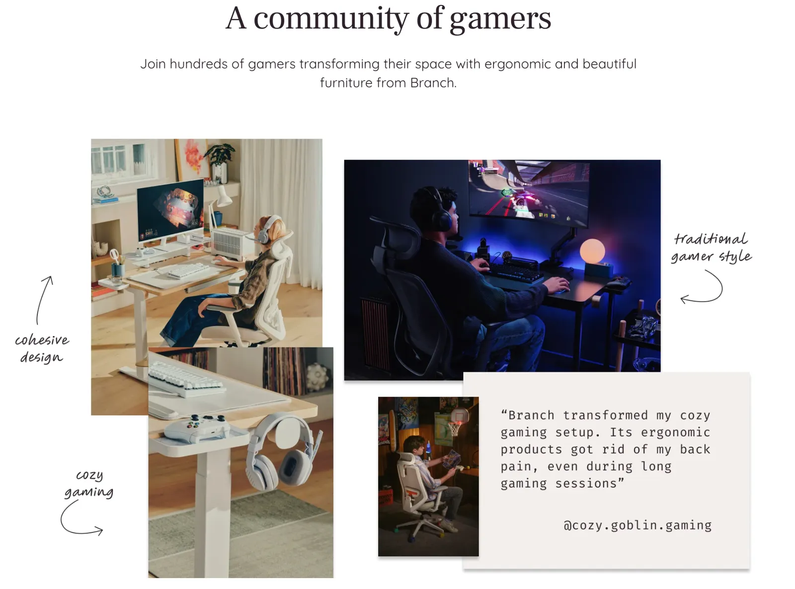
Branch Furniture puts this method into practice with its gaming landing page. Every element speaks to gamers, from the “battle tested” microcopy to reviews from gamers using its furniture. There’s also a special mention of its SEGA collaboration.
Strong hero visuals or product demonstration
Place a visual that shows your product in action and grabs a visitor’s attention above the fold. Video can work well: Wyzowl’s 2026 study shows 85% of people have been convinced to buy a product or service after watching a video.
If you are including video, disable autoplay. Autoplaying elements lose 7% of conversions, on average.
Benefits before features when traffic is colder
If customers don’t have any prior knowledge of your brand, hook them by leading with product benefits over product features. Earbuds brand Shokz, for example, uses the headline “Secure earbuds that stay in place.”
Nik Sharma calls this the grandma test: “Your grandma should be able to go to a product page and fully understand, What does the product do? Why does it exist? How’s it going to benefit me?”
Position these benefits in an F-shape on the page. Nielsen Norman Group’s eye-tracking research found people tend to read in this pattern, a behavior that has remained unchanged since the first study in 2006.
Social proof: reviews, testimonials, UGC, press, and creator validation
Digital Applied’s 2026 research found that featuring testimonials or reviews with real customer names has the highest lift on landing page conversion rate (22%) of any feature.
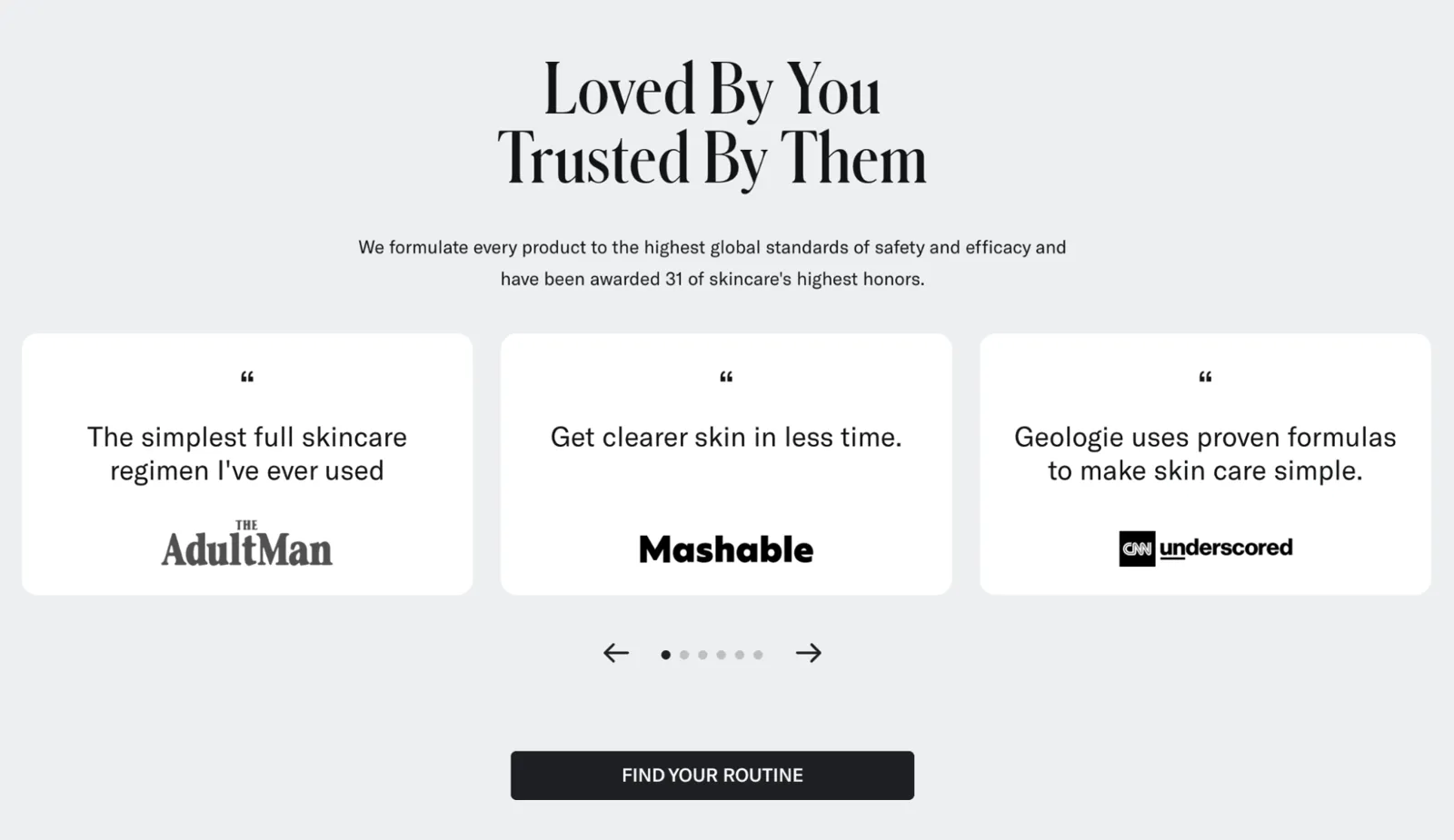
Skin care brand Geologie combines multiple testimonials on its reviews landing page. The headline “Loved by you, trusted by them” introduces customer and press quotes:
Trust signals: shipping clarity, returns, and payment options
Instead of sending landing page visitors elsewhere for extra context (like answering “Why should I trust this brand?”), add trust signals like these to your landing page:
- Shipping clarity. Narvar’s 2025 research found almost three-quarters of shoppers say a brand’s estimated delivery date has influenced whether they purchased an item.
- Returns policies. Route’s 2026 study found 93% of customers review a retailer’s return policy before buying online, with 82% saying easy returns influence their decision to buy.
- Payment options. “Not enough payment methods” is the reason behind 10% of all cart abandonments. Choose a payment gateway that supports multiple options.
Mobile-first layout and load speed
Unbounce’s report found almost 70% of customers say page speed impacts their willingness to buy from a retailer. Check yours with Google’s free PageSpeed Insights tool, then apply its recommendations.
Combine fast load speeds with a mobile-first layout that includes finger-friendly buttons and white space. Mobile devices contributed 52% of all website traffic in Q1 2026.
Reduced navigation and distraction
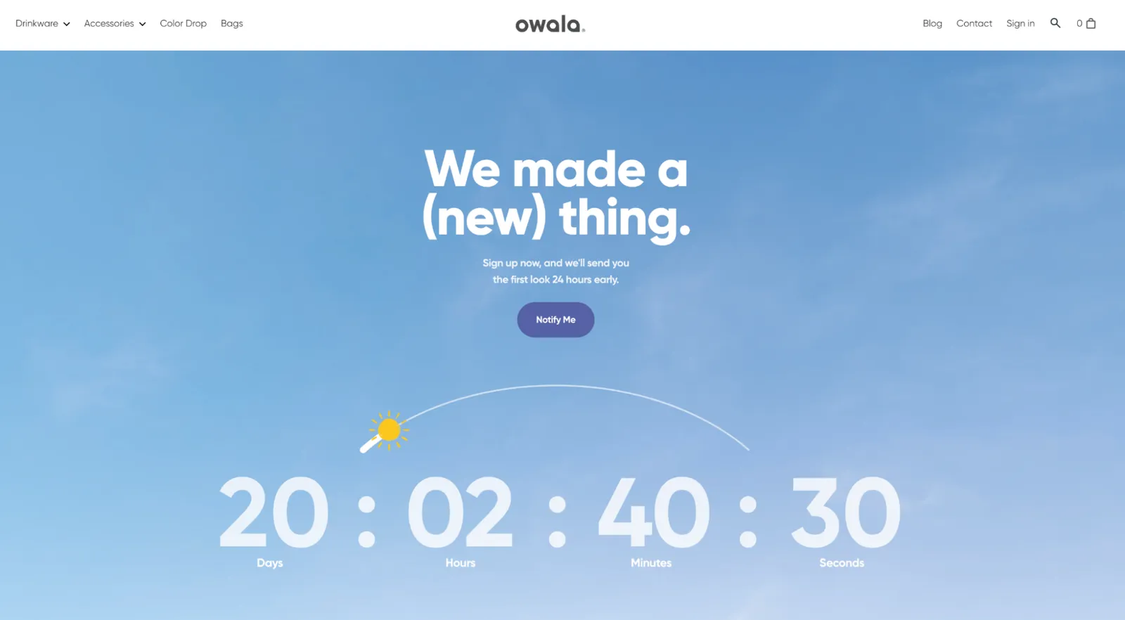
Keep visitors’ attention on your offer by removing distractions. Water bottle brand Owala, for example, includes a short headline and countdown timer on its Coming Soon page. It encourages users to sign up for notifications and scroll down to view a teaser.
Clear pricing and what’s included
Display clear pricing on the landing page and exactly what’s included: shipping, taxes, or import fees for international orders. This all-in cost could prevent 39% of abandoned carts.
FAQ or objections section near the CTA
Reference your buyer personas to answer the questions your specific audience has, and answer them on the landing page.
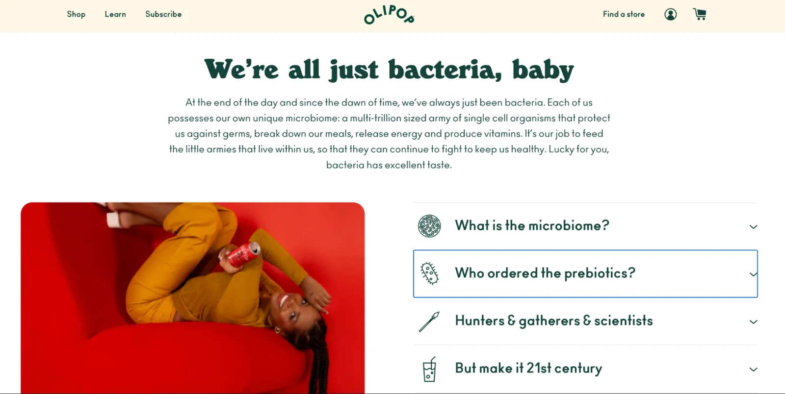
Beverage company Olipop has a landing page dedicated to explaining the digestive health benefits of its prebiotic soda. It answers questions like “What is the microbiome?” and “What are probiotics?”
Personalization
Personalized landing pages use data you’ve already collected on a customer to adjust the content they see. For example, you could:
- Show products a customer previously viewed or added to their cart
- Provide social proof from customers who share the same demographics
- Promote local pickup options for shoppers within a certain radius of your retail store
Apps like Nosto pull from unified customer profiles to personalize landing page content. These profiles, built when customers share their email addresses or phone numbers with your business, give a real-time 360-degree view of each shopper.
Ecommerce landing page examples
Get inspired by these real-life scenarios and examples from successful brands:
Waitlist landing page
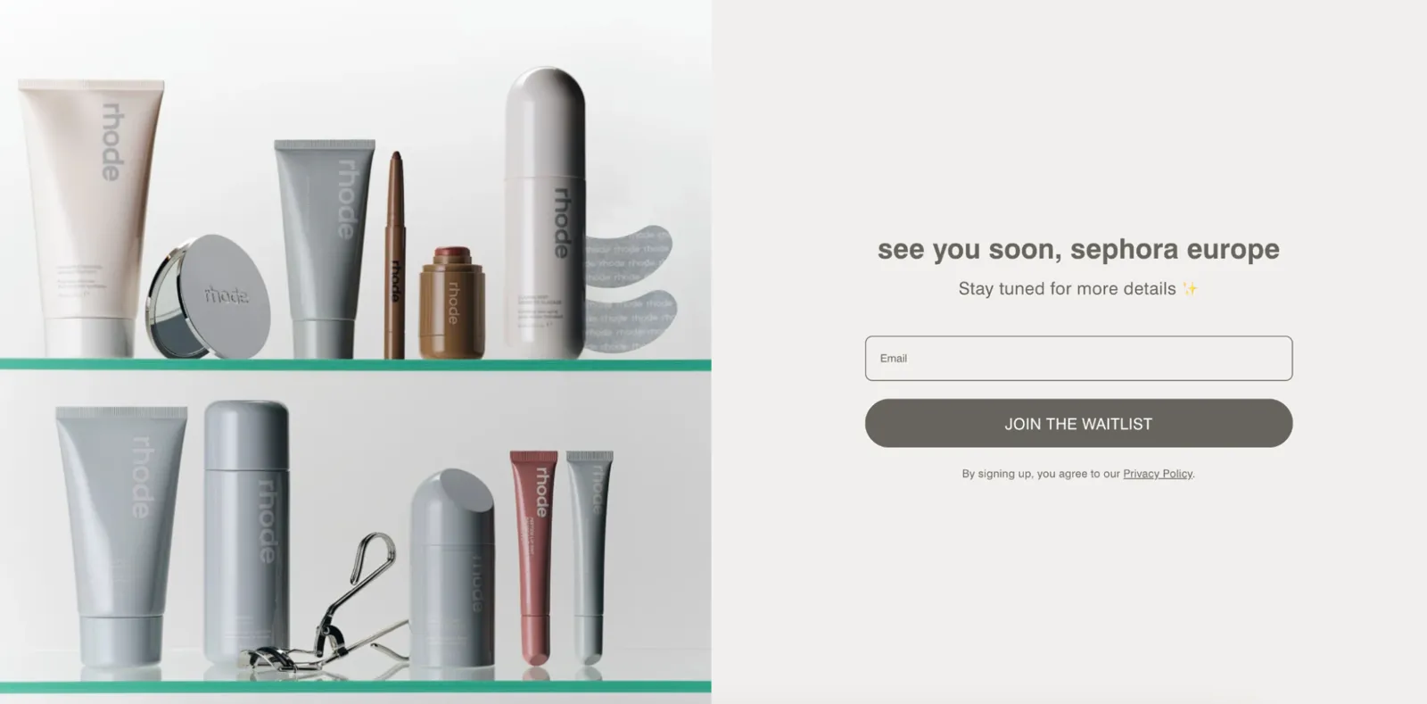
Skin care brand Rhode Skin created a landing page to capture the details of shoppers interested in its Sephora Europe launch. The page itself is simple: an image of its product assortment, a “See you soon” headline, and an email opt-in form.
This call to action lets Rhode collect first-party data. Emails give it a direct line of communication with shoppers, which it can use to further promote its launch.
Subscription landing page
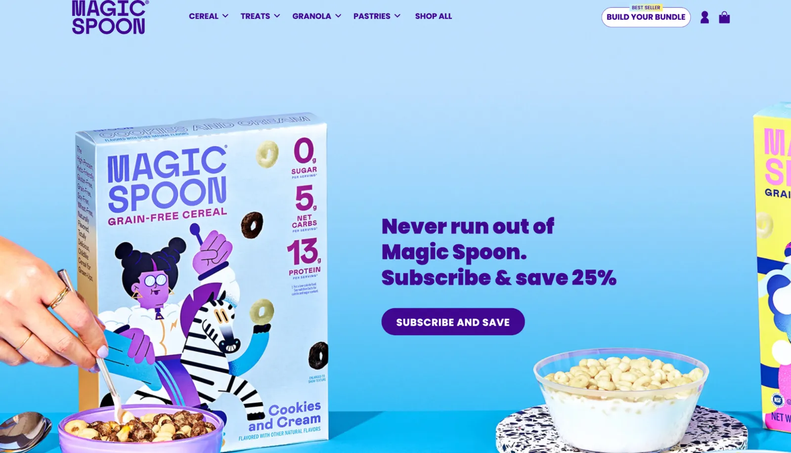
The landing page for breakfast brand Magic Spoon’s cereal subscription leans heavily into the benefits of subscribing. Above the fold, customers see the 25% discount on offer.
Further down is a subscription configurator that lets visitors choose flavors to add to their order. There’s also a list of FAQs that match the brand’s fun tone of voice (like “What kind of sorcery is this? Where did all the carbs and sugar go?”).
Store locator landing page
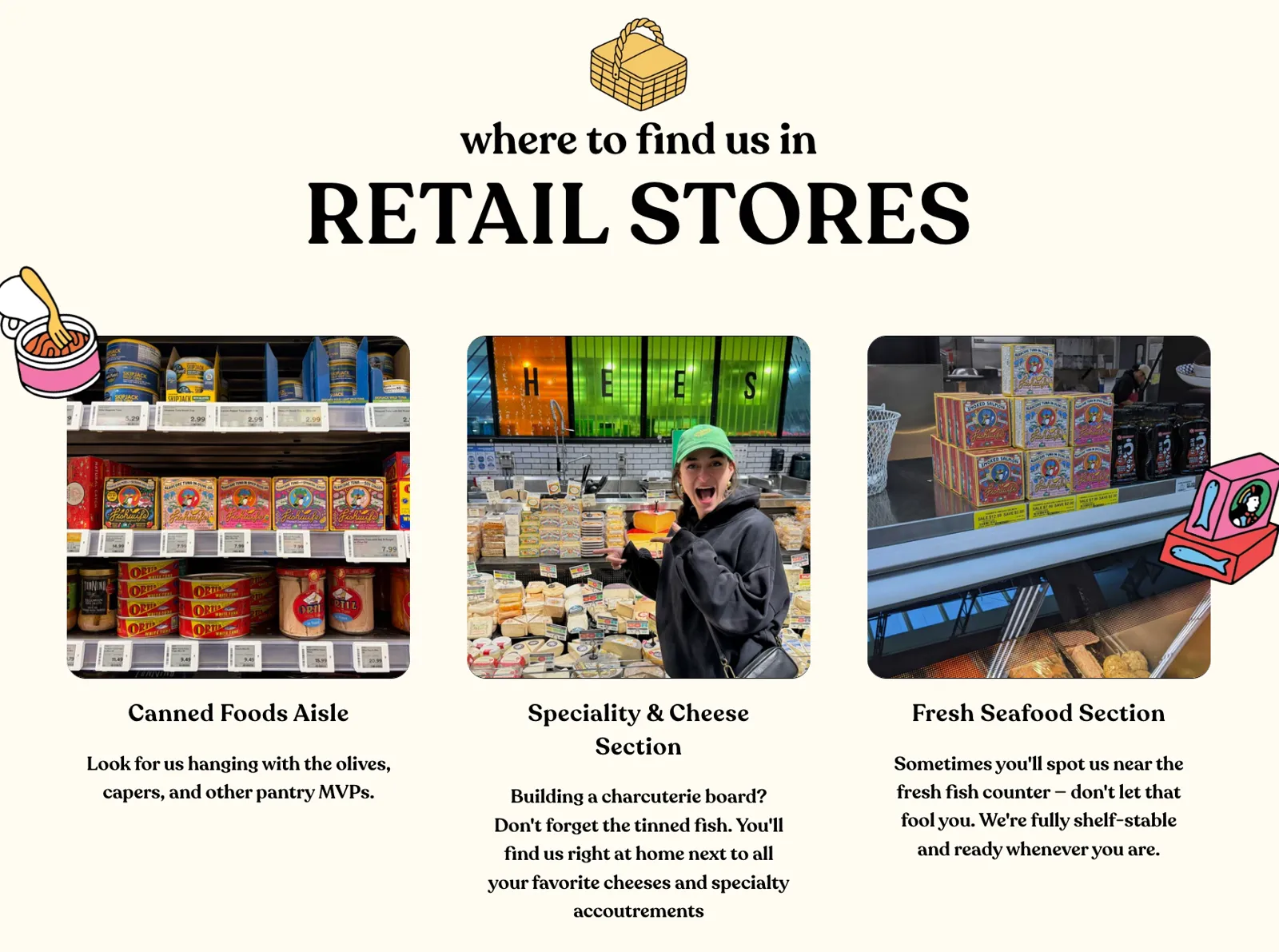
Tinned fish brand Fishwife has a store locator landing page where customers can enter their address to find local stockists. Beneath the store locator widget is a guide on where to find Fishwife products in retail stores. Customers looking specifically for its products know exactly where to look.
Local landing page
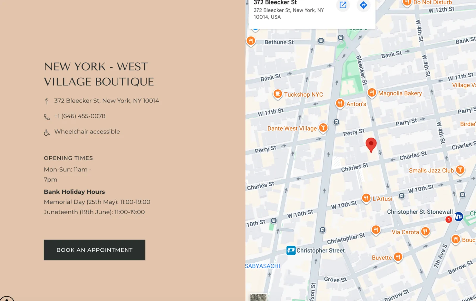
Astrid & Miyu has retail stores across the UK, the EU, and the US. Each one has a local landing page designed to give nearby shoppers the information they need before visiting.
The landing page for its New York West Village location includes:
- A Google Maps pin of the store
- A phone number to get in touch
- Opening hours
- In-store services
- CTAs to book a shopping appointment
Personalized recommendations landing page
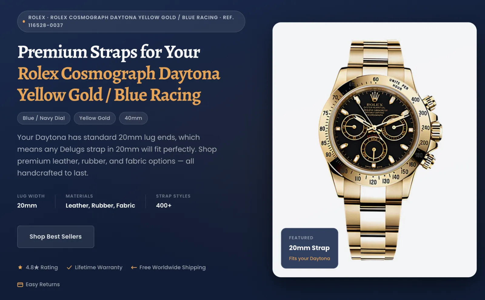
Watch accessory brand Delugs built a watch strap finder to help customers filter products that suit their watch. On the results landing page, customers see easy returns, free worldwide shipping, and lifetime warranty options beside the 4.8-star rating:
Ecommerce landing page testing and metrics
Website analytics show what happens when people visit your landing page. Track metrics like conversion rate, average order value, and bounce rate for this segment. Then run A/B tests to see whether the following elements influence key performance indicators:
- Headline and hero images
- CTA copy and placement
- Long-form vs. short-form copy
- Social proof placement
- Offer framing: discount vs. bundle vs. bonus vs. free shipping
Look beyond landing page activity to analyze continuation rate: how many people who view your landing page quit at checkout? Insights here can help you tweak the page to prevent drop-offs.
The same segmentation logic applies on the landing page: knowing which product combinations convert together tells you which offers to lead with.
“We wanted to test recommending certain products to certain purchasers who had certain things in their cart,” says Adam Davis, senior marketing manager at Magnolia Bakery. “We uncovered learnings where it was like, ‘Okay, a banana pudding purchaser is more likely to add a cupcake to their cart. So why don’t we show that customer a cupcake on the sidebar once they have banana pudding already in their cart?’”
Segment landing page data by traffic source instead of judging all potential customers by the same rubric. Unbounce’s report found visitors who arrive on a landing page through email convert 60% more often than visitors who arrive through paid search, and 370% more than those who clicked display ads.
Mike De Lia, ecommerce manager at wallet brand Ridge, found a $30 difference in average order value between two different landing pages. He dug deeper and found an underperforming ad sent low-quality traffic to one of them. “If the traffic you get is bad, the landing pages aren’t going to work,” Mike says.
FAQ
When should an online store use a dedicated landing page?
Use a dedicated landing page when you’re targeting a specific audience. Branch Furniture, for example, has a landing page for gamers. It can use paid ads and email campaigns to reach a “gaming” segment and offer a personalized experience when customers land on the website.
What should an ecommerce landing page include?
An ecommerce landing page should include one clear call to action, high-quality images, a clear value proposition, headlines that showcase product benefits, social proof, trust signals, reduced navigation, answers to FAQs, and a responsive layout for mobile users.
Can a landing page sell directly, or should it send visitors to a product page?
Landing pages can sell directly by including buy buttons on the page. If you’re using the landing page to showcase a range of products, you could swap them for CTAs that send visitors to the relevant product pages.
How do you measure ecommerce landing page performance?
Measure ecommerce landing page performance with metrics like conversion rate, average order value, bounce rate, average time on page, scroll depth, and traffic source.
Can Shopify merchants A/B test landing pages?
Yes. Shopify merchants can A/B test landing pages with apps like Nosto and Shogun. They show a different version of the page to control and variant groups, then monitor how the change affects user behavior.
If you want a landing page or online store that brings in leads, take a look at our website and Shopify store design services.