How to make a beautiful, text-only PowerPoint presentation (no images)
A PowerPoint with no images at all. Sounds like hell — endless blocks of text with the grace of a Word document. Turning that information into something legible and beautiful is hard. Far from impossible.

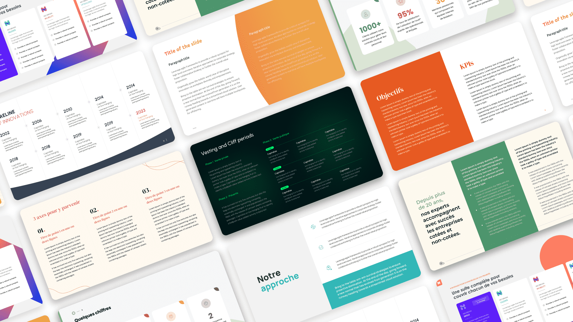
📌TL;DR: A successful text-only presentation relies on visual hierarchy, contrasting typography and generous white space. Limit each slide to one main idea (max 6 lines), differentiate font sizes and align elements — the result feels professional and reads effortlessly.
In this guide we'll walk through the four pillars of a beautiful text slide: typography, layout, working with text and structure. Plus a bonus — when and how to use emojis as pictograms.
Choose a typeface
Your presentation is made of text only. The choice of typography will therefore have a major impact on the result.
System fonts aren't the most aesthetic and give us a limited range. Head to Google Fonts — a huge library of free, royalty-free typefaces.
Before deciding, ask yourself: what is my presentation about and who am I talking to? You'll choose a font based on the content. There are countless fonts, but they fall into four families:
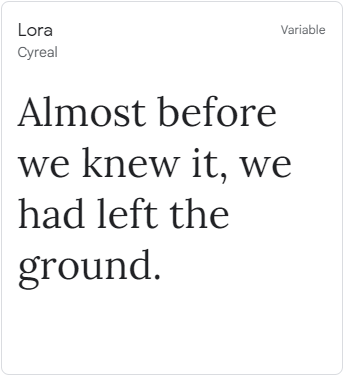
Serif: Serif typefaces. Formal, elegant, refined. Pick them to highlight a serious-business or premium feel.
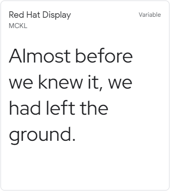
Sans Serif: Sans serif typefaces. Modern, simple, universal. The fonts that work for almost any topic — and the typical choice for body text.
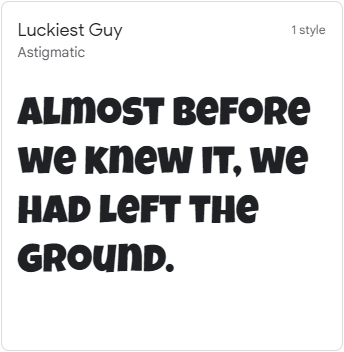
Display: Stylized fonts. Varied and often expressive. Use them when you want to give your content a strong identity. Best reserved for titles, not body copy.
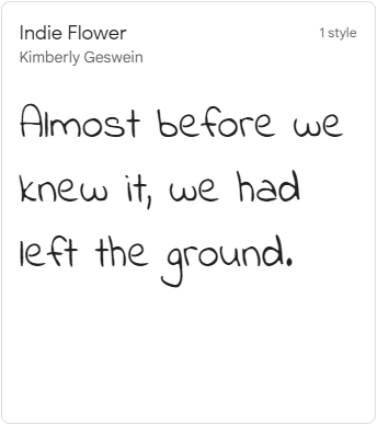
Handwriting: Handwriting fonts. Usage is similar to Display — great for accents and titles, not for long passages.
💡Good news: Google Fonts lets you filter by these categories, which makes your search much faster. 😎
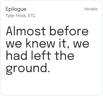
I used Epilogue for this article — Bold for titles and Regular for body. If I had used a serif for the titles, I would have picked a sans serif for the body. (Mixing font families across reading levels is good practice.)
Design your layouts based on the content
We now have our typography. The next question: how do we make each slide legible, understandable and finally beautiful?
Let's start with understanding. For the message of a slide to land at first glance, the layout must match the content. Forget huge repeating title bars — focus on the core message.
First, look at the content and assign levels of importance to each piece of information. Below is an example of the process from raw text to a finished slide:
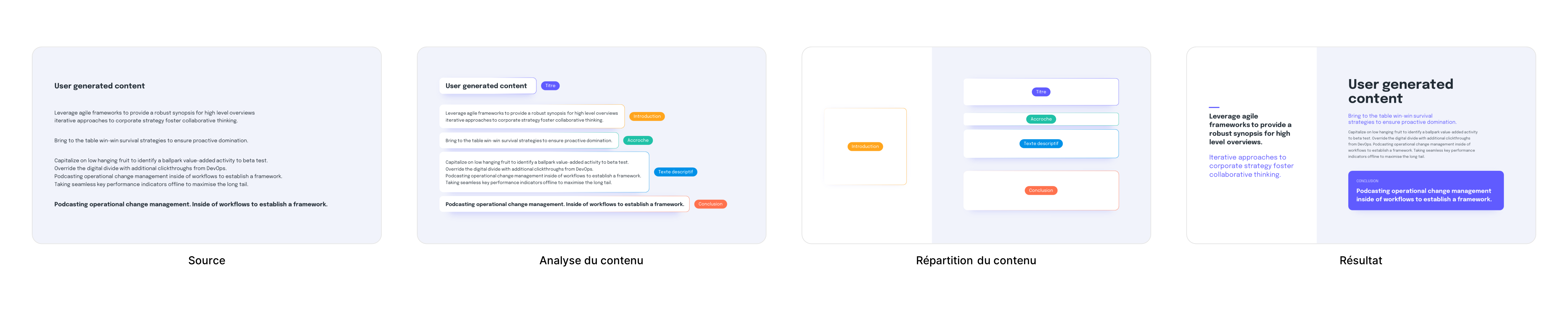
Now we lay out the content.
A slide packed with information is exactly what you want to avoid. In some cases, you'll need to split that content across several slides to keep the audience with you.
Once your content is sorted by importance, organize it accordingly. You decide what to highlight — and that decision directly shapes the layout:
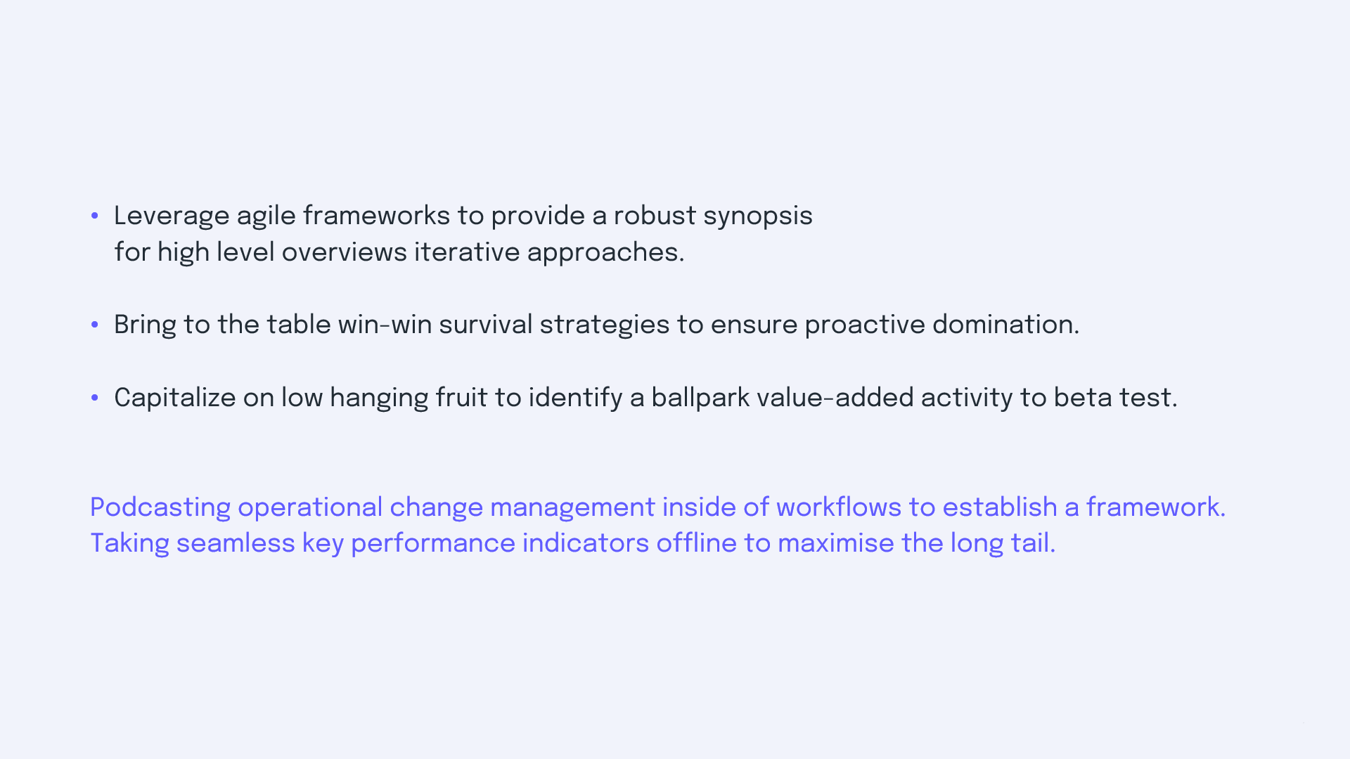
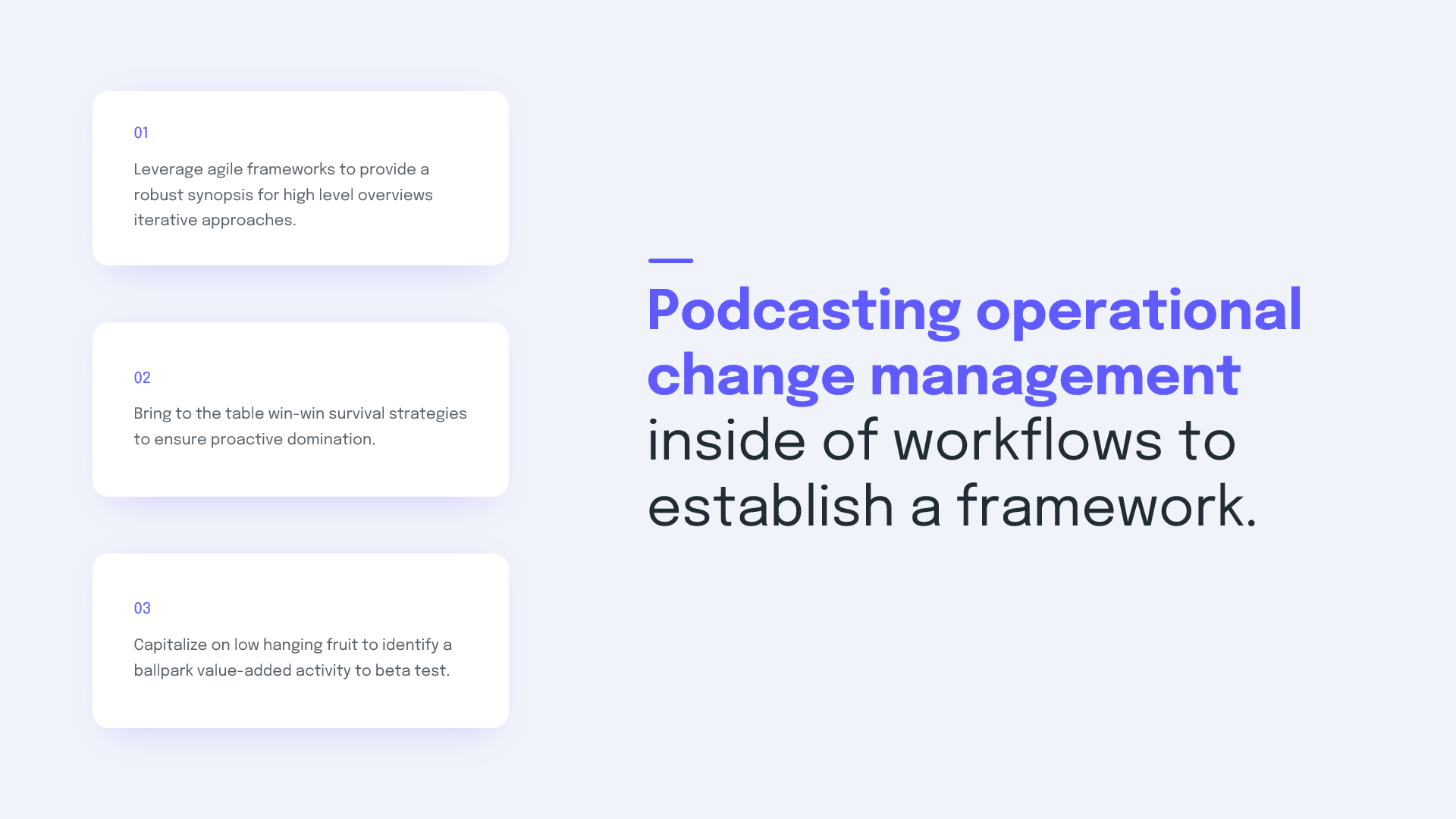
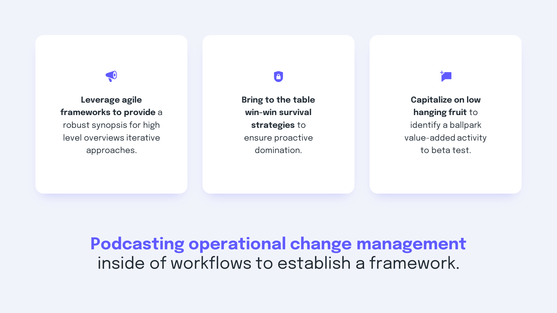
📋In summary: understand what should stand out more or less, and organize the content accordingly.
Take care of your text
Now let's focus on the text itself and its readability.
To make every piece of information clear, define reading levels. The difference between a heading and its body text should be obvious — so treat them differently (size, weight, color):
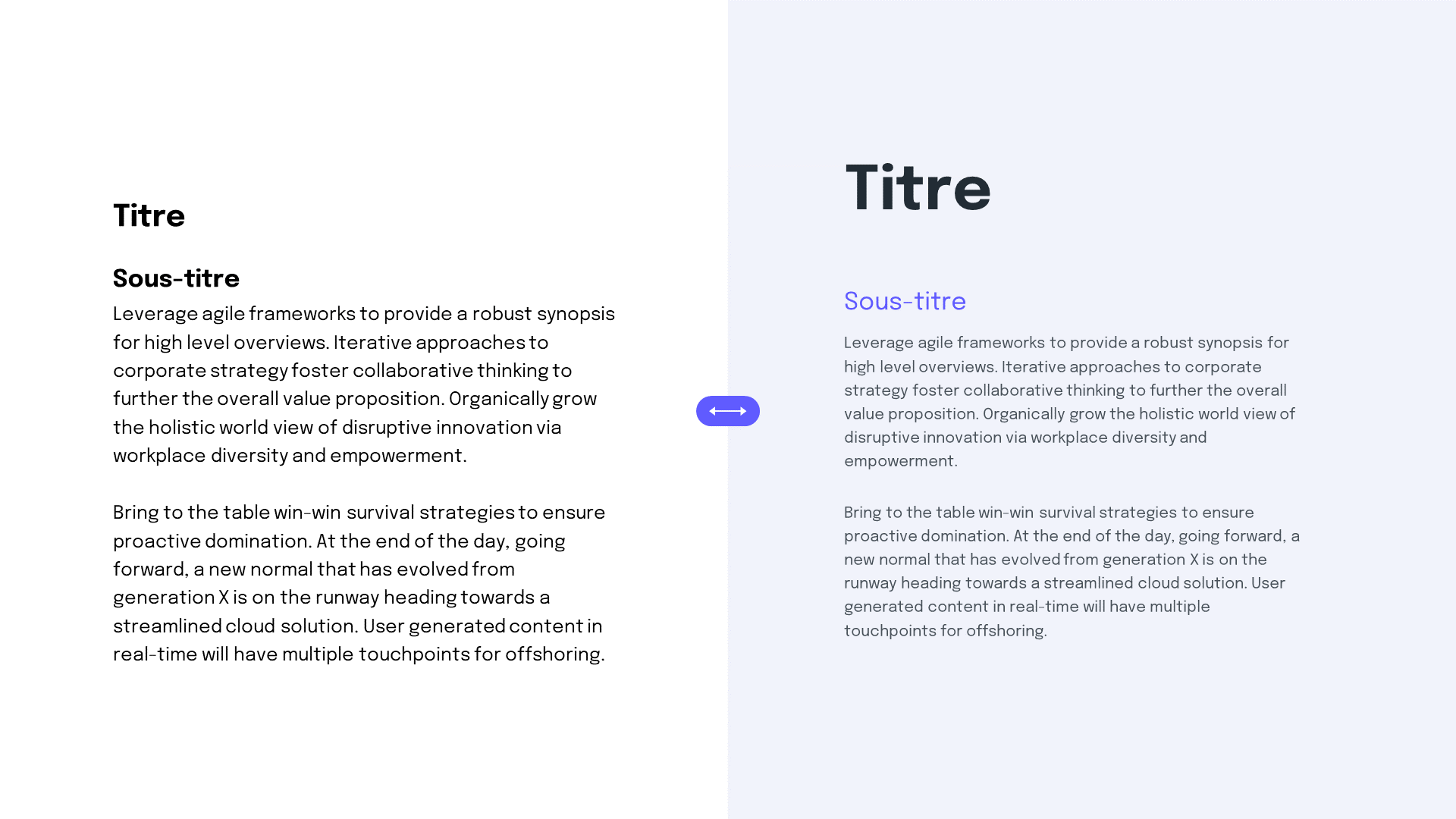
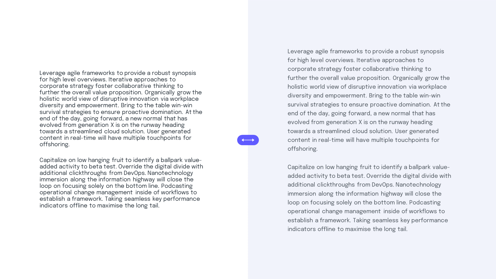
Even a block of body text can be a pleasure to read if you tune the line spacing. The default line height is usually too tight for body copy. A small bump lets the lines breathe and gives the content character.
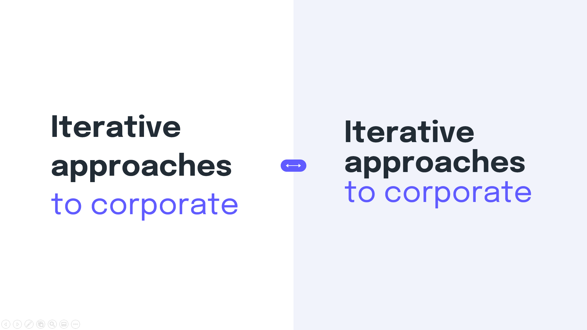
For titles, it's the opposite — the default line spacing tends to be too loose. Tighten it so the lines aren't drifting apart, otherwise readability suffers.
📋In summary: tune line spacing to the size of the text and clearly define reading levels.
Set a structure and a code to follow
Now, aesthetics. For your presentation to feel unified, you need a few rules to stick to. (Aesthetics and discipline go hand in hand.)
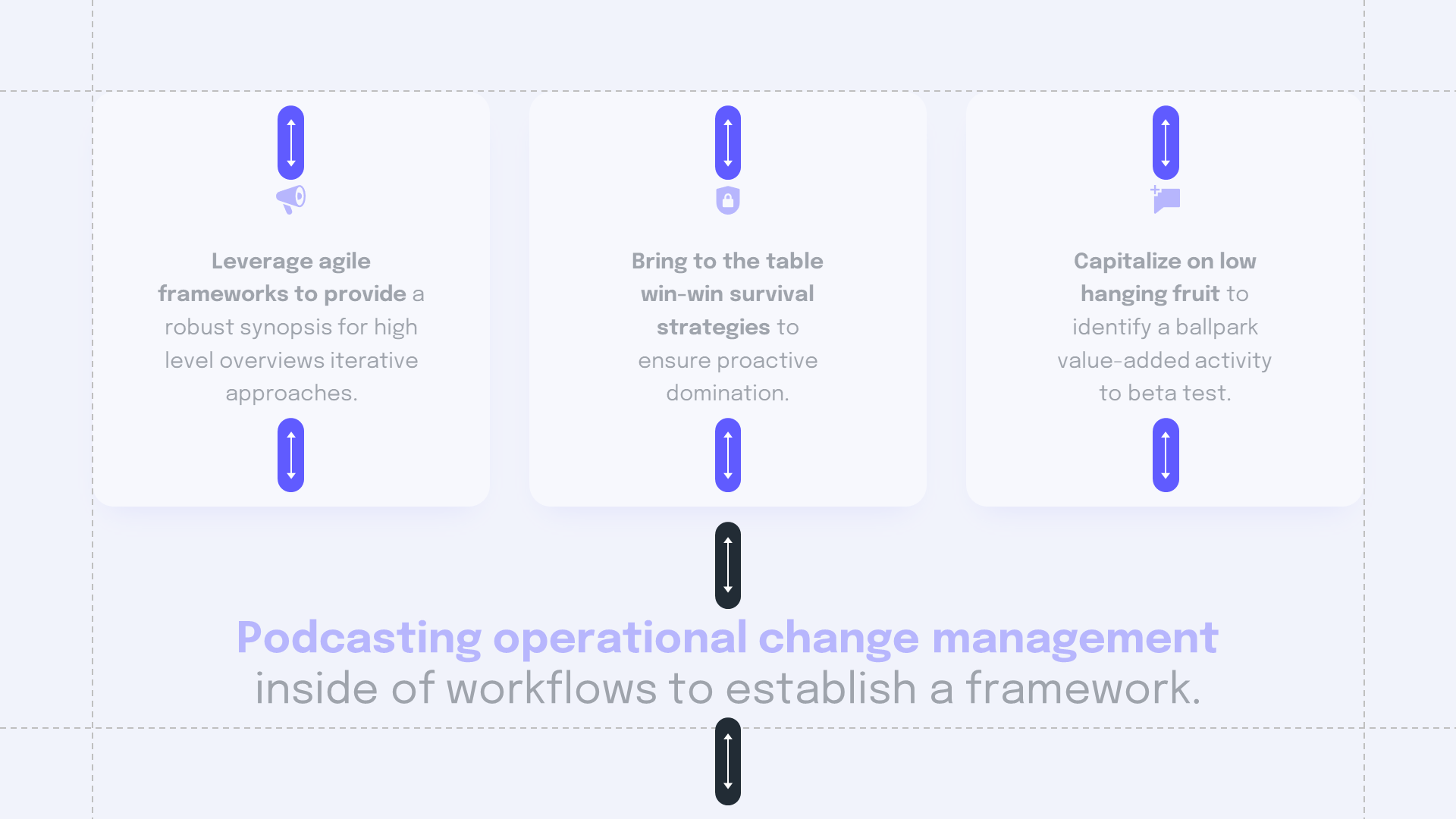
Structural rules first. Setting margins on your slides keeps the look consistent across every slide — and makes designing them faster.
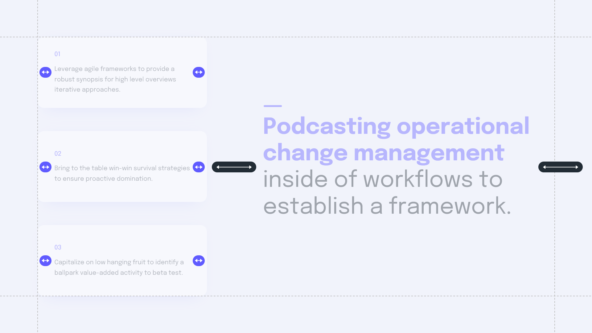
The same principle applies inside your blocks. Internal padding keeps them coherent and prevents text from sticking to the edge of a frame.
Bonus: Emojis
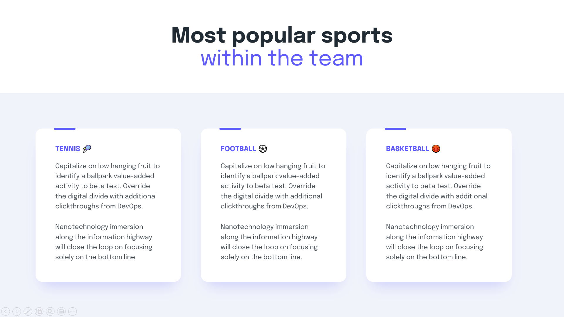
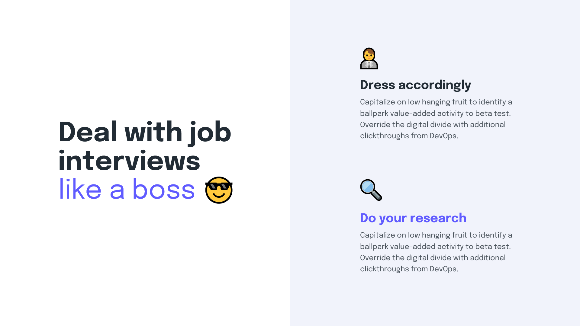
Inserting emojis can breathe life into your content — as long as the placement makes sense.
On Windows, insert one directly with the Windows + . shortcut — perfect while editing body text.
A panel pops up letting you pick an emoji to insert after your text. They also work great in empty text frames as pictograms — varied, already installed and instantly available.

Conclusion
A text-only presentation doesn't have to be boring. Well-chosen typography, a clear hierarchy, breathing line spacing and rules you respect on every slide are enough. The result feels elegant and professional — and delivers your content more precisely than an image-stuffed deck ever would.
When you need help with professional presentations, check out our services at PeknéPrezky.sk.
'%3e%3cg%3e%3cg%20clip-path='url(%23clip0)'%3e%3cg%20clip-path='url(%23clip1)'%3e%3cg%20clip-path='url(%23clip2)'%3e%3cpath%20d='M42.2903%206.48009%2037.5197%201.70949C36.9562%201.146%2036.0425%201.146%2035.479%201.70949L30.7084%206.48009C30.2956%206.89285%2030.2956%207.56209%2030.7084%207.97488%2031.1211%208.38769%2031.7903%208.38769%2032.2031%207.97492L35.4604%204.73558C35.3251%2018.2709%2028.8666%2022.8405%2024.9997%2024.3607%2024.7212%2024.4702%2024.4394%2024.5702%2024.1543%2024.6608%2024.4533%2023.5617%2024.6761%2022.4433%2024.8209%2021.3136%2025.2952%2017.5644%2024.7544%2014.4593%2023.297%2012.5703%2021.0817%209.69872%2018.1357%208.40341%2015.0033%208.92243%2013.4035%209.19858%2011.9099%209.90805%2010.6851%2010.9737%209.44744%2012.0265%208.51416%2013.3913%207.98207%2014.9266%206.95868%2017.928%207.73529%2021.1154%2010.1133%2023.6717%2012.3931%2026.1228%2016.0101%2027.4462%2019.8085%2027.4461%2020.1948%2027.4461%2020.5826%2027.4323%2020.9716%2027.4045%2020.447%2028.6318%2019.8231%2029.8142%2019.1062%2030.94%2016.6406%2034.8015%2011.0472%2040.9488%201.28823%2038.7374%200.718472%2038.6156%200.157894%2038.9788%200.0361458%2039.5486-0.0835124%2040.1086%200.265397%2040.6617%200.822294%2040.795%202.2854%2041.1332%203.78171%2041.307%205.28339%2041.313%207.92696%2041.3246%2010.5362%2040.7137%2012.8998%2039.5297%2015.9982%2037.9815%2018.7592%2035.404%2020.8844%2032.0759%2021.8907%2030.4935%2022.7285%2028.8101%2023.3841%2027.0532%2024.1978%2026.8725%2024.9962%2026.6288%2025.772%2026.3242%2029.1932%2024.979%2032.0632%2022.4904%2034.0714%2019.1272%2036.3368%2015.3337%2037.513%2010.4981%2037.5709%204.74972L40.7959%207.97475C41.2087%208.38752%2041.8779%208.38752%2042.2907%207.97471%2042.7034%207.56192%2042.7034%206.89269%2042.2906%206.47993ZM22.7279%2021.0489C22.5458%2022.4549%2022.2349%2023.8412%2021.7992%2025.1903%2017.8943%2025.7249%2013.8966%2024.6417%2011.6577%2022.2348%209.79897%2020.2366%209.20266%2017.8833%209.97861%2015.6075%2010.7816%2013.2529%2012.9394%2011.4029%2015.3479%2011.0038%2015.6673%2010.9506%2015.9904%2010.9237%2016.3141%2010.9235%2018.2891%2010.9235%2020.1473%2011.9417%2021.6263%2013.8589%2022.7245%2015.2823%2023.1259%2017.9029%2022.7279%2021.0488Z'%20fill='%23BFBFBF'%20fill-rule='nonzero'%20fill-opacity='1'%20transform='matrix(0.771742%200.635935%200.635935%20-0.771742%20356.612%204176.52)'/%3e%3c/g%3e%3c/g%3e%3c/g%3e%3c/g%3e%3c/g%3e%3c/svg%3e)