Pie chart: definition, calculation and use in PowerPoint
A statistical pie chart is a graphical representation that divides a circle into sectors whose size is proportional to the values they represent. Each sector illustrates a category or part of a whole, making it possible to instantly visualize the distribution of data in percentages. This graph is particularly effective for showing the composition of a set and comparing proportions between different categories.

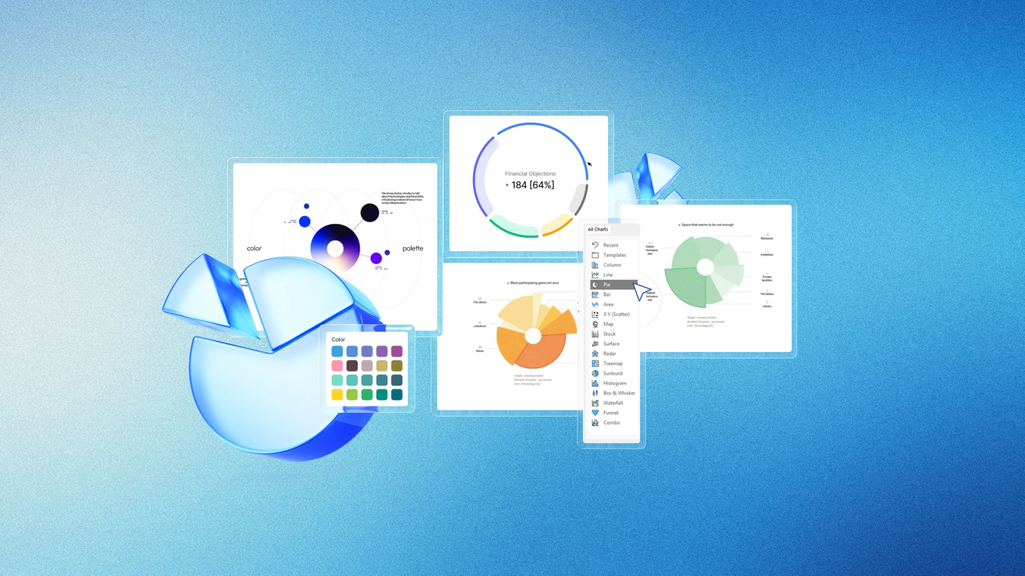
📌TL;DR: How to properly use a pie chart in PowerPoint — the basic rules.
- A pie chart visualizes shares of a whole in percentages.
- In PowerPoint, create it via Insert > Chart in 5 steps.
- Use a maximum of 5-7 categories for clarity.
- For more than 7 categories, choose a bar chart instead.
- Animations and sector emphasis improve the data story.
Definition: A pie chart is a circular graph where each angular sector visually represents the proportion of a category relative to the total, with an area proportional to the value it illustrates.
Quick pie chart creation in PowerPoint
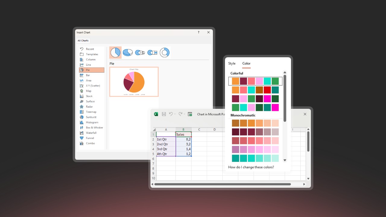
PowerPoint simplifies pie chart creation through its intuitive interface. The chart is created in a few steps and updates automatically when you modify data. If you want professional charts perfectly integrated with your visual identity, our presentation design agency creates custom data visualizations.
Creation in 5 steps:
- Insert > Chart – select Pie (2D recommended)
- Enter data in the Excel sheet that opens automatically
- Customize colors via Design > Chart Styles
- Add labels with percentages (Design > Add Element)
- Adjust size and position chart on slide
💡Key point: Create your pie charts directly in PowerPoint rather than importing images. This preserves the ability to modify data later.
Sector angle calculation
Each angle is calculated with the formula: Angle = (Value / Total) × 360°. For example, a category representing 25% of the total occupies 90 degrees (0.25 × 360).
| Percentage | Angle (degrees) | Circle fraction |
|---|---|---|
| 10% | 36° | 1/10 |
| 25% | 90° | 1/4 |
| 33.3% | 120° | 1/3 |
| 50% | 180° | 1/2 |
⚠️Caution: Always verify that percentage sum equals 100%. A calculation error will distort interpretation.
Practical use cases
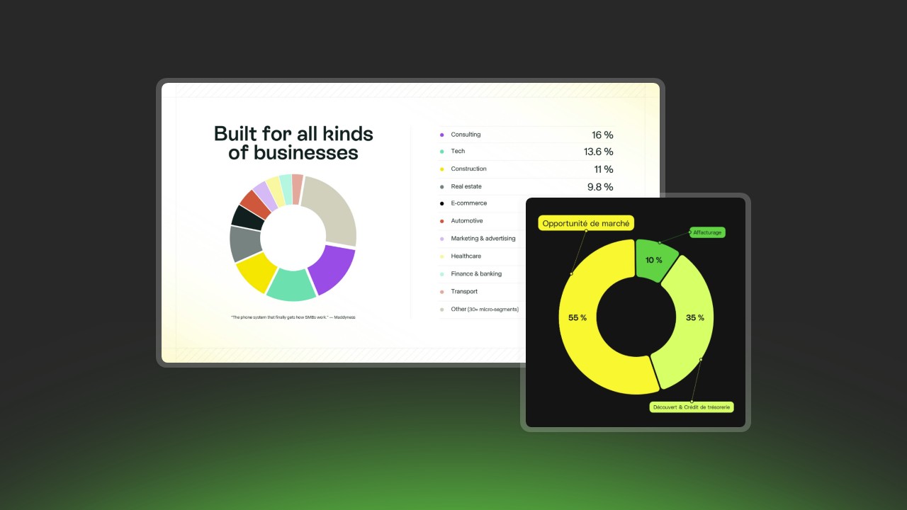
Budget distribution
Pie charts excel at visualizing resource allocation. Here's an annual marketing budget example:
| Budget item | Amount | Percentage |
|---|---|---|
| Digital Marketing | €45 000 | 45% |
| Events | €30 000 | 30% |
| Communication | €15 000 | 15% |
| Market Research | €10 000 | 10% |
💡Key point: For budgets, add absolute amounts in addition to percentages to provide real scale.
Market share distribution
Instantly visualize competitive positions, particularly useful for sales presentations:
| Company | Market share | Positioning |
|---|---|---|
| Leader A | 35% | Dominant |
| Challenger B | 28% | Main competitor |
| Player C | 18% | Third position |
| Player D | 12% | Niche |
| Others | 7% | Fragmented |
Demographic composition
Age ranges, geographic distributions, or customer segments naturally form categories for pie charts:
| Segment | Percentage | Characteristic |
|---|---|---|
| 18-25 years | 22% | Young professionals |
| 26-35 years | 35% | Core target |
| 36-50 years | 28% | Established |
| 51-65 years | 12% | Active seniors |
| 65+ years | 3% | Retirees |
Design best practices
Optimal number of categories
The golden rule: 5-7 categories maximum. Beyond this, sectors become too small and difficult to distinguish.
| Number of sectors | Readability | Recommendation |
|---|---|---|
| 2-3 | Excellent | Ideal for simple comparisons |
| 4-5 | Very good | Standard professional format |
| 6-7 | Acceptable | Recommended upper limit |
| 8+ | Difficult | Use bar chart |
- Group categories < 5% into 'Others'
- Remove values < 3% if not relevant
- Create second pie chart detailing 'Others' if necessary
📋Quick summary: 3-5 categories = optimal. 6-7 = acceptable. 8+ = consider bar chart.
Color usage
- High contrast between adjacent sectors
- Consistency with your brand guidelines
- Accessibility for colorblind (avoid only red-green)
- Visual hierarchy: bright colors for important, pastels for secondary
- Maximum 5-7 different colors
💡Key point: Use your brand guidelines as base, then adjust shades to ensure sufficient contrast.
Effective labels
- Readable font, minimum size 10-12 pt
- Sufficient text/background contrast
- Rounded percentages (one decimal max: 34.5%)
- Short category name (2-4 words)
- Consistent alignment
Optimal placement:
- Sectors > 15%: labels inside in white
- Sectors < 15%: external labels with leader lines
- Long names: use separate legend
Animation and emphasis in PowerPoint
Sector animation
Animation transforms data revelation into captivating narrative experience.
| Animation type | Effect | When to use |
|---|---|---|
| Wipe by sector | Progressive appearance | Category-by-category presentation |
| Explosion | Sector separation | Highlighting key category |
| Rotation | Pie chart rotation | Introduction effect |
| Fade | Soft appearance | Subtle transition |
- Select the pie chart
- Animations > Add Animation > Wipe
- Effect Options > Chart Animation > By element in series
- Set to 'On Click' for manual control
- Add 0.5-1 second delay between sectors
📋Quick summary: Use 'Wipe' with 'On Click' trigger to control when each sector appears.
Emphasis techniques
Impact hierarchy (from strongest to most subtle):
- Explosion + bright color for key sector (maximum impact)
- Saturated color for important, pastels for others
- Larger font for main label
- Text annotation with arrow pointing to sector
- Differentiated animation: key sector appears last with zoom
💡Key point: Only explode one sector per pie chart. Exploding multiple sectors dilutes effect.
- Use Insert > Text Boxes for comments
- Add arrows (Insert > Shapes) pointing to key sectors
- Keep annotations concise (5-10 words maximum)
- Use rhetorical techniques like anaphora to reinforce key messages
When to use bar chart
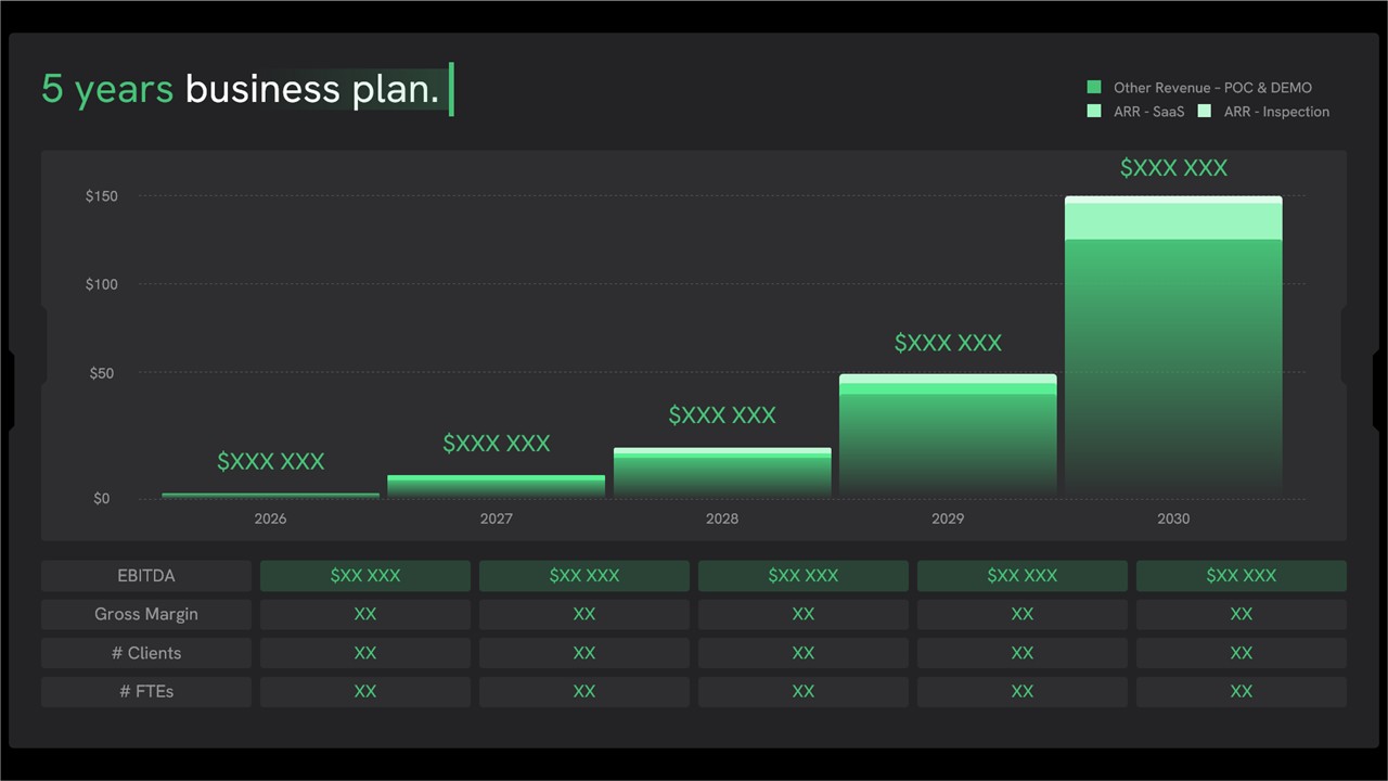
Pie charts have limits. Bar charts are preferable for:
| Situation | Why bars are better |
|---|---|
| More than 7 categories | Manages 10-20 categories without problem |
| Compare multiple periods | 100% stacked bars facilitate comparison |
| Precision required | Eye evaluates lengths better than angles |
| Close values | Subtle differences more visible |
| Long category names | Space on left for complete text |
⚠️Caution: To compare distributions over time, favor 100% stacked bars rather than multiple side-by-side pie charts.
- Superior reading precision
- Many categories managed without confusion
- Comparisons facilitated by common alignment
- Null values visible (0% sector invisible in pie chart)
Data preparation checklist
Before creating your pie chart, verify:
- Clearly defined and named categories
- Complete numeric values for each category
- No overlap between categories
- Sum of values = 100% of total
- 'Others' category for values < 5%
- Maximum 5-7 visible categories
- Organized data: names column + values column
⚠️Caution: Avoid mixing data of different nature (e.g., financial amounts and already calculated percentages).
FAQ
What is the difference between pie chart and circular diagram?
No difference: both terms designate the same graph. 'Pie chart' is the common English term, while 'circular diagram' is the official technical terminology.
How many categories can be displayed in a pie chart?
The optimal limit is between 3 and 7 categories. Beyond 7 sectors, group minor values (< 5%) into 'Others' or use a bar chart.
When should you prefer a bar chart?
Favor bars for: comparing multiple distributions, more than 7 categories, reading precision need, or small differences between categories. Bars allow more precise visual comparison.
Should you use 3D pie charts?
No, 3D pie charts are not recommended because perspective distorts proportions and makes reading less precise. Background sectors appear smaller than they are. Favor 2D pie charts.
Conclusion
The pie chart is a powerful tool for visualizing proportions and simple distributions. Limit yourself to 5-7 categories, use contrasting colors, and create directly in PowerPoint to maintain flexibility. For complex comparisons or many categories, prefer bar charts. Master animations and emphasis to transform your data into captivating visual narrative during your presentations.
🎯Need a professional presentation design where data speaks clearly? Visit pekneprezky.sk
'%3e%3cg%3e%3cg%20clip-path='url(%23clip0)'%3e%3cg%20clip-path='url(%23clip1)'%3e%3cg%20clip-path='url(%23clip2)'%3e%3cpath%20d='M42.2903%206.48009%2037.5197%201.70949C36.9562%201.146%2036.0425%201.146%2035.479%201.70949L30.7084%206.48009C30.2956%206.89285%2030.2956%207.56209%2030.7084%207.97488%2031.1211%208.38769%2031.7903%208.38769%2032.2031%207.97492L35.4604%204.73558C35.3251%2018.2709%2028.8666%2022.8405%2024.9997%2024.3607%2024.7212%2024.4702%2024.4394%2024.5702%2024.1543%2024.6608%2024.4533%2023.5617%2024.6761%2022.4433%2024.8209%2021.3136%2025.2952%2017.5644%2024.7544%2014.4593%2023.297%2012.5703%2021.0817%209.69872%2018.1357%208.40341%2015.0033%208.92243%2013.4035%209.19858%2011.9099%209.90805%2010.6851%2010.9737%209.44744%2012.0265%208.51416%2013.3913%207.98207%2014.9266%206.95868%2017.928%207.73529%2021.1154%2010.1133%2023.6717%2012.3931%2026.1228%2016.0101%2027.4462%2019.8085%2027.4461%2020.1948%2027.4461%2020.5826%2027.4323%2020.9716%2027.4045%2020.447%2028.6318%2019.8231%2029.8142%2019.1062%2030.94%2016.6406%2034.8015%2011.0472%2040.9488%201.28823%2038.7374%200.718472%2038.6156%200.157894%2038.9788%200.0361458%2039.5486-0.0835124%2040.1086%200.265397%2040.6617%200.822294%2040.795%202.2854%2041.1332%203.78171%2041.307%205.28339%2041.313%207.92696%2041.3246%2010.5362%2040.7137%2012.8998%2039.5297%2015.9982%2037.9815%2018.7592%2035.404%2020.8844%2032.0759%2021.8907%2030.4935%2022.7285%2028.8101%2023.3841%2027.0532%2024.1978%2026.8725%2024.9962%2026.6288%2025.772%2026.3242%2029.1932%2024.979%2032.0632%2022.4904%2034.0714%2019.1272%2036.3368%2015.3337%2037.513%2010.4981%2037.5709%204.74972L40.7959%207.97475C41.2087%208.38752%2041.8779%208.38752%2042.2907%207.97471%2042.7034%207.56192%2042.7034%206.89269%2042.2906%206.47993ZM22.7279%2021.0489C22.5458%2022.4549%2022.2349%2023.8412%2021.7992%2025.1903%2017.8943%2025.7249%2013.8966%2024.6417%2011.6577%2022.2348%209.79897%2020.2366%209.20266%2017.8833%209.97861%2015.6075%2010.7816%2013.2529%2012.9394%2011.4029%2015.3479%2011.0038%2015.6673%2010.9506%2015.9904%2010.9237%2016.3141%2010.9235%2018.2891%2010.9235%2020.1473%2011.9417%2021.6263%2013.8589%2022.7245%2015.2823%2023.1259%2017.9029%2022.7279%2021.0488Z'%20fill='%23BFBFBF'%20fill-rule='nonzero'%20fill-opacity='1'%20transform='matrix(0.771742%200.635935%200.635935%20-0.771742%20356.612%204176.52)'/%3e%3c/g%3e%3c/g%3e%3c/g%3e%3c/g%3e%3c/g%3e%3c/svg%3e)