How to create a PowerPoint cover page that makes an impact
The cover page of your presentation is like a book cover — it decides whether your audience will pay attention or reach for their phone. You have just a few seconds to make an impression. In this article, we'll show you how to create a professional cover page in PowerPoint step by step.


📌TL;DR: The opening slide should contain max 50 words, use clear typographic hierarchy (title 60–80pt), 2–3 colors with min 4.5:1 contrast ratio, and one strong visual. Avoid clutter and inconsistency with the rest of the presentation.
What is a cover page and why does it matter
The cover page is the first slide of your presentation. It serves as a visual and contextual introduction to the content that follows. It typically contains the main title, a subtitle, the author or organization name, and the date.
Why does it matter so much? Because you have roughly 3 seconds to capture your audience's attention. A well-designed cover page fulfills three key functions: clearly identifies the topic, establishes presenter credibility, and sets the visual tone for the entire presentation.
If your cover page looks generic or unprofessional, the audience will subconsciously lower their expectations — regardless of how strong your actual content is.

What should the opening slide contain
Less is more. The opening slide should have a maximum of 4 to 6 elements and the total word count shouldn't exceed 50. Every element must serve a clear purpose.
| Element | Funkcia | Dôležitosť |
|---|---|---|
| Main title | Communicates the topic | Critical |
| Subtitle | Contextualizes the approach | High |
| Author / organization | Builds credibility | High |
| Date | Temporal context | Medium |
| Brand logo | Reinforces identity | Medium to high |
💡Recommended element order by size: 1) presentation title (largest), 2) subtitle, 3) presenter name, 4) role/position, 5) organization logo, 6) date (smallest).
Method 1: Start from a template
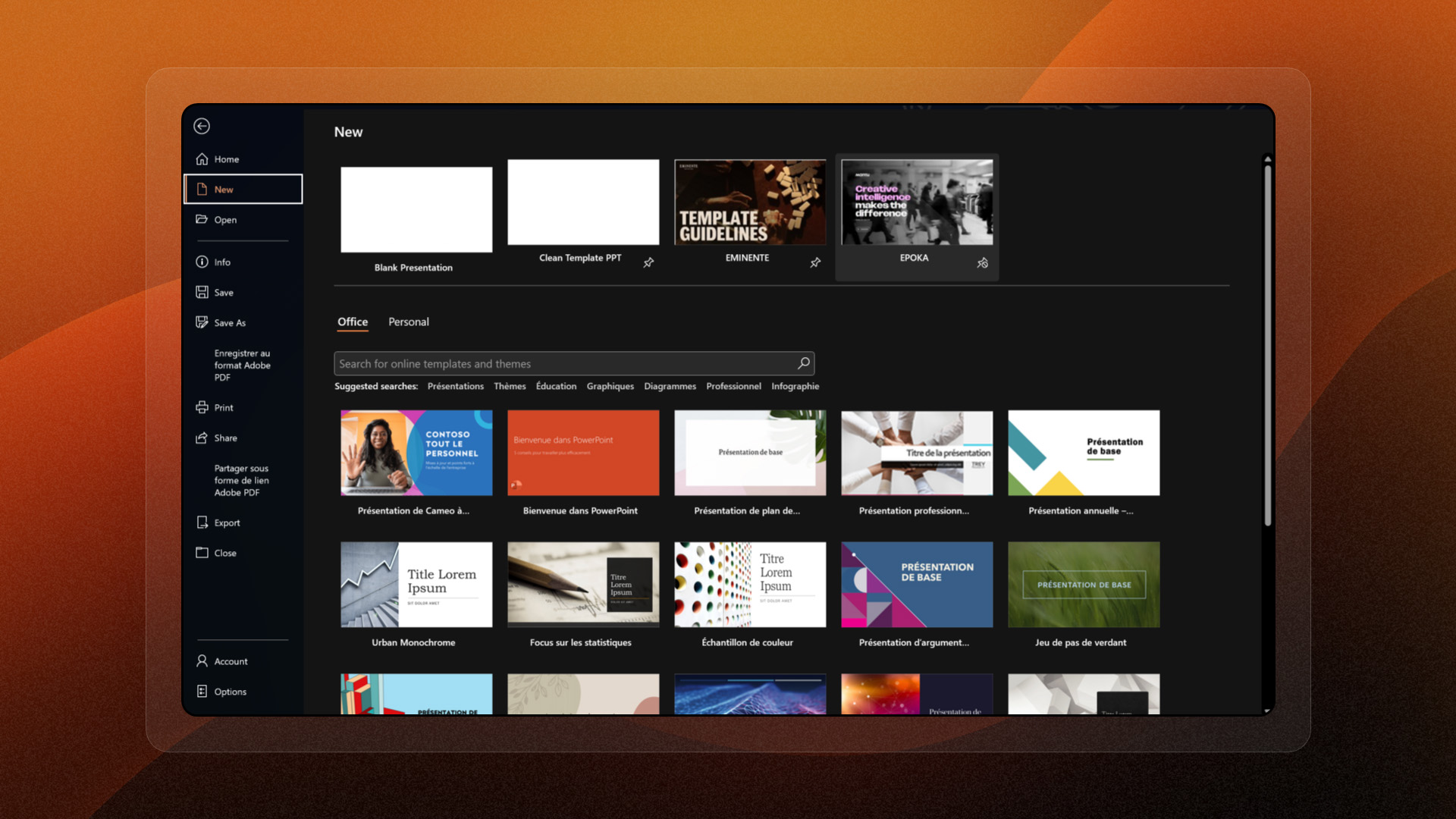
The quickest way to start is to use a predefined template in PowerPoint. Open File → New and search for 'professional presentation' or 'cover page'. Select the template closest to your needs and customize it.
The advantages of templates are clear: instant professional layout, consistent visual style, and clearly defined content zones. Templates also help you maintain proper proportions and element placement.
⚠️Always customize standard templates with your own colors and logo — otherwise your presentation will look generic.
Method 2: Create a custom cover page
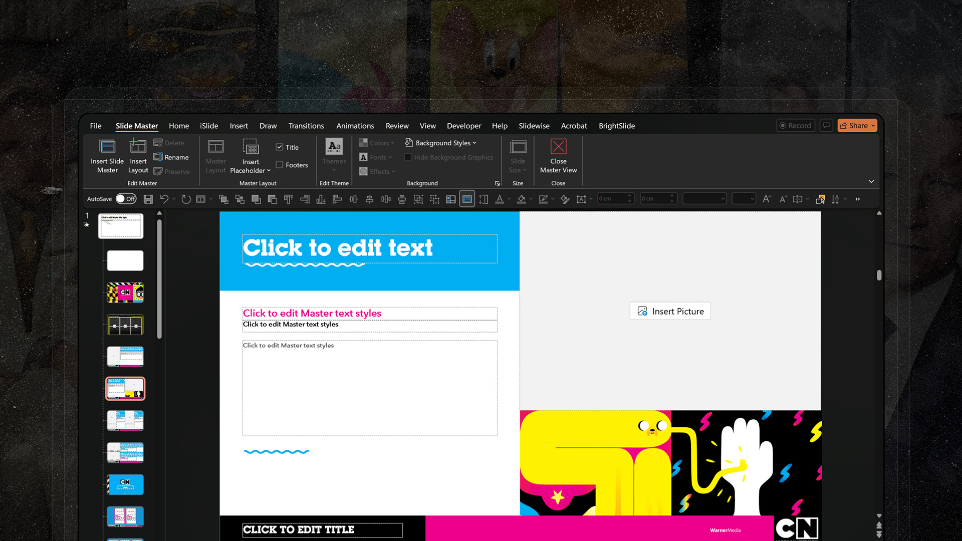
If you want full control, create your cover page from scratch. Start via View → Slide Master, define your custom color palette (Design → Colors → Customize Colors), select fonts, and add text boxes with the title (60–80pt).
Don't forget alignment — use guides (View → Guides) to precisely position all elements. When satisfied, save the result as a template (.potx) for reuse.
For layout, follow these rules: outer margins at least 5% on each side, spacing between title and subtitle at 1.5–2x line height, and 40–60% white space for an airy design.
Typographic hierarchy — the foundation of readability
Hierarchy guides the viewer's eye. The main title should visually dominate (60–80pt, bold), followed by the subtitle (30–40pt, regular or light) and secondary information like name and date (18–24pt).
The human eye naturally follows a 'Z' path on a slide. Place the title at the top, visual in the center, and identification info at the bottom.
Proven font pairings: Montserrat Bold + Open Sans Regular (modern and professional), Playfair Display + Source Sans Pro (elegant), Roboto Bold + Roboto Light (clean and consistent).
Colors and contrast
Choose a maximum of 2 to 3 colors aligned with your brand. Ensure a minimum contrast ratio of 4.5:1 between text and background — this guarantees readability even in projection.
Color psychology matters too: blue conveys trust and professionalism, green growth and sustainability, red energy and urgency, purple creativity and luxury.
⚠️Always test your cover page in projection mode — the contrast on a monitor vs. a projector screen differs significantly.
Images and visuals
Images create an immediate emotional impact. Use high-resolution photographs (minimum 1920×1080 pixels). Look for photos with neutral zones or empty spaces where you can place text without losing readability.
If you want text over a photo, add a semi-transparent overlay: insert a rectangle, set fill color to black or brand color, and transparency to 30–50%. This significantly improves text contrast.
For free professional images, great sources include Unsplash, Pexels, and Pixabay. For more exclusive photos, there's Shutterstock or Adobe Stock.
Mistakes to avoid
Information overload: If your slide has less than 40% white space, more than 50 words, or more than 5 visual elements, it's overloaded. The solution? Limit yourself to the main message (title) and secondary message (subtitle).
Insufficient contrast: Light gray text on white background is a classic mistake. Use tools like WebAIM Contrast Checker to verify contrast ratios. Quick fix — darken text, lighten backgrounds, or add an overlay.
Visual inconsistency: More than 3 font families or changing color palettes between slides signal a lack of professionalism. Define a design system from the start and use Slide Master to automatically apply styles.
Consistency with the full presentation
The cover page sets the visual rules for all following slides. Same color palette, same fonts, same spacing system. The logo should be prominent on the cover page, discreet in a corner on internal slides — but in the same position.
Create a master template (.potx) with your colors, fonts, and logo. All team members will then automatically apply the same visual identity.
Conclusion
The cover page is your first opportunity to capture attention and build credibility. Invest in a clean, thoughtful design aligned with your brand identity — and your presentations will have a significantly stronger impact from the very first second.
Don't have time to worry about it? Leave it to us.
🎯We'll create a professional presentation with a cover page that makes an impact. Check out pekneprezky.sk
'%3e%3cg%3e%3cg%20clip-path='url(%23clip0)'%3e%3cg%20clip-path='url(%23clip1)'%3e%3cg%20clip-path='url(%23clip2)'%3e%3cpath%20d='M42.2903%206.48009%2037.5197%201.70949C36.9562%201.146%2036.0425%201.146%2035.479%201.70949L30.7084%206.48009C30.2956%206.89285%2030.2956%207.56209%2030.7084%207.97488%2031.1211%208.38769%2031.7903%208.38769%2032.2031%207.97492L35.4604%204.73558C35.3251%2018.2709%2028.8666%2022.8405%2024.9997%2024.3607%2024.7212%2024.4702%2024.4394%2024.5702%2024.1543%2024.6608%2024.4533%2023.5617%2024.6761%2022.4433%2024.8209%2021.3136%2025.2952%2017.5644%2024.7544%2014.4593%2023.297%2012.5703%2021.0817%209.69872%2018.1357%208.40341%2015.0033%208.92243%2013.4035%209.19858%2011.9099%209.90805%2010.6851%2010.9737%209.44744%2012.0265%208.51416%2013.3913%207.98207%2014.9266%206.95868%2017.928%207.73529%2021.1154%2010.1133%2023.6717%2012.3931%2026.1228%2016.0101%2027.4462%2019.8085%2027.4461%2020.1948%2027.4461%2020.5826%2027.4323%2020.9716%2027.4045%2020.447%2028.6318%2019.8231%2029.8142%2019.1062%2030.94%2016.6406%2034.8015%2011.0472%2040.9488%201.28823%2038.7374%200.718472%2038.6156%200.157894%2038.9788%200.0361458%2039.5486-0.0835124%2040.1086%200.265397%2040.6617%200.822294%2040.795%202.2854%2041.1332%203.78171%2041.307%205.28339%2041.313%207.92696%2041.3246%2010.5362%2040.7137%2012.8998%2039.5297%2015.9982%2037.9815%2018.7592%2035.404%2020.8844%2032.0759%2021.8907%2030.4935%2022.7285%2028.8101%2023.3841%2027.0532%2024.1978%2026.8725%2024.9962%2026.6288%2025.772%2026.3242%2029.1932%2024.979%2032.0632%2022.4904%2034.0714%2019.1272%2036.3368%2015.3337%2037.513%2010.4981%2037.5709%204.74972L40.7959%207.97475C41.2087%208.38752%2041.8779%208.38752%2042.2907%207.97471%2042.7034%207.56192%2042.7034%206.89269%2042.2906%206.47993ZM22.7279%2021.0489C22.5458%2022.4549%2022.2349%2023.8412%2021.7992%2025.1903%2017.8943%2025.7249%2013.8966%2024.6417%2011.6577%2022.2348%209.79897%2020.2366%209.20266%2017.8833%209.97861%2015.6075%2010.7816%2013.2529%2012.9394%2011.4029%2015.3479%2011.0038%2015.6673%2010.9506%2015.9904%2010.9237%2016.3141%2010.9235%2018.2891%2010.9235%2020.1473%2011.9417%2021.6263%2013.8589%2022.7245%2015.2823%2023.1259%2017.9029%2022.7279%2021.0488Z'%20fill='%23BFBFBF'%20fill-rule='nonzero'%20fill-opacity='1'%20transform='matrix(0.771742%200.635935%200.635935%20-0.771742%20356.612%204176.52)'/%3e%3c/g%3e%3c/g%3e%3c/g%3e%3c/g%3e%3c/g%3e%3c/svg%3e)